The 2014 Ebola Outbreak – Playing with the numbers
My flight was delayed for and hour and a half getting out of Chicago tonight so I’ve started playing around with numbers, something I am wont to do when I have free time. This evening we’re taking a look at the current ebola crisis developing in West Africa. Perhaps you’ve heard something about it lately.
I read this story before leaving town last week based on the eye-popping, brain jarring headline, CDC: Ebola could infect 1.4 million in Liberia and Sierra Leone by end of January. It made me pause. If that is a true scenario it is something that should make you seriously stop in your tracks and think about the future. It marks the difference between a disease that rears its ugly head from time to time to one that has become endemic to a population, much the way HIV is today. However, ebola makes HIV look like the common cold in terms of its aggressiveness and mortality rate.
What makes this year’s outbreak so newsworthy? To put things into perspective note that in the years since its discovery in 1976, the largest number of ebola cases in any one year has been 425 during the Ugandan outbreak of 2000-2001 [1]. That contrasts dramatically with the current number in West Africa, which as of September 23, 2014 is 6,574 [2]. What’s even more staggering is that this outbreak started off just as in any other year, with a small handful of cases, 45 around March 23, 2014. This time it hit West Africa, primarily Sierra Leone and Liberia. Perhaps it is the large, poorly funded segments of these populaces that accounts for the uncontrollable growth this time.
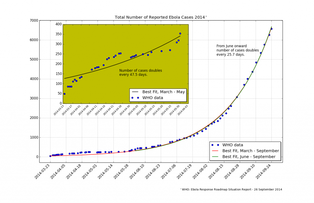
I’ve heard the phrase exponential growth associated with the outbreak, which is not unusual with epidemics. If you look at Figure 2 it appears that the number of ebola cases increases but not aggressively so during the first three months. Then something happens at the beginning of June to make it explode. That is the thing with exponential growth; a relatively small population can become huge before you know it.
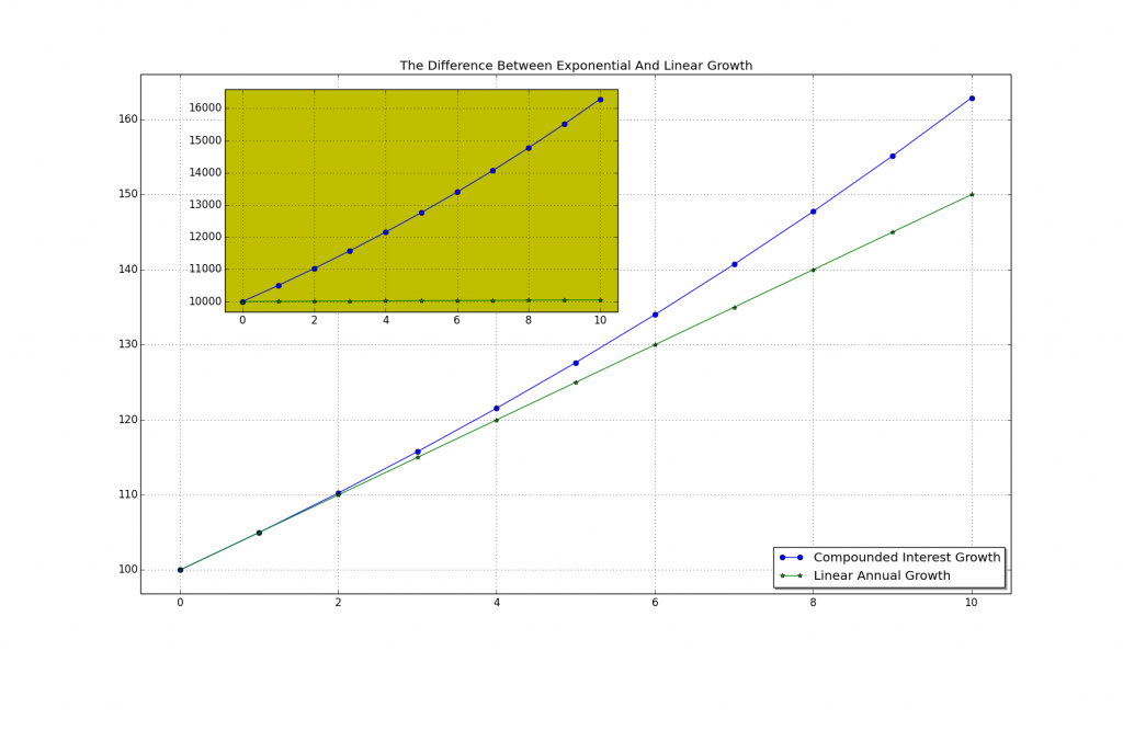
What does it mean to say that something experiences exponential growth? A mathematical function undergoes exponential growth when the growth rate of the function is proportional to the function’s current value at any point in time. We are used to dealing with this when thinking about interest rates on savings accounts, for example. Suppose your money earns interest at the rate of 5% = 0.05 per year. If you deposited $100 then the curve in Figure 1 shows what your balance would be at the end of every year for the next 10 years.
Contrast this with linear growth, a process by which your balance would only increase by a fixed amount at each time step (a year in this example). If instead of offering you a fixed interest rate (exponential growth rate) your bank offered you only $5 a year on your balance then you would have the straight green line in the figure. The difference after 10 years is only $12.89 but you are not likely to invest a mere $100 and let it sit for 10 years. The inset plot shows the difference if instead you deposited $10,000 and let it sit for 10 years at the same 5% growth rate versus adding $5/year. With the linear growth plan you still end up with only an extra $50 after 10 years but the compounded interest plan has grown to $16,289, a difference of $6,239. Exponential growth is good!
In Figure 2 I’ve plotted the number of reported ebola cases as of 23 September.
Those are the blue dots. I then used Python routines to fit this data to an exponential function, y = y0 Exp(t/τ). y0 is the initial number of cases, the 45 people back towards the end of March. τ in the exponent controls the rate of growth. If it is a large number the population will grow slowly but if it is a small number the population will rapidly increase. In nearly all cases of interest this number is not fixed but depends on a range of parameters. For disease outbreaks it depends on such things as the density of the infected population, the incubation period of the infectious agent, and so on. A key indicator epidemiologists look for is the time it takes for an infected population to double in size. This gives emergency response teams something to plan around. It allows for estimating needed supplies, medicines, hospital beds, etc, that will be required to stem the epidemic. Fitting the known data over the entire time span reveals a pretty good curve, shown in red. That the data displays exponential growth is quite clear. The initial data does not fit the curve as well because during these first key months the lower number of cases combined with available resources and response times kept the disease from rampant growth. The inset plot shows the best exponential curve fit for this period. The curve indicates that initially the number of new cases was doubling every 47.5 days. Then towards the end of May, about the time news outlets were just getting interested, things got desperate. These communities were overrun with cases and had a diminished ability to properly treat the victims. The red curve, as well as a new fit covering only the data from June onwards (in green), show that the number of cases is now doubling every 25.7 days. This is the situation where things stand right now.
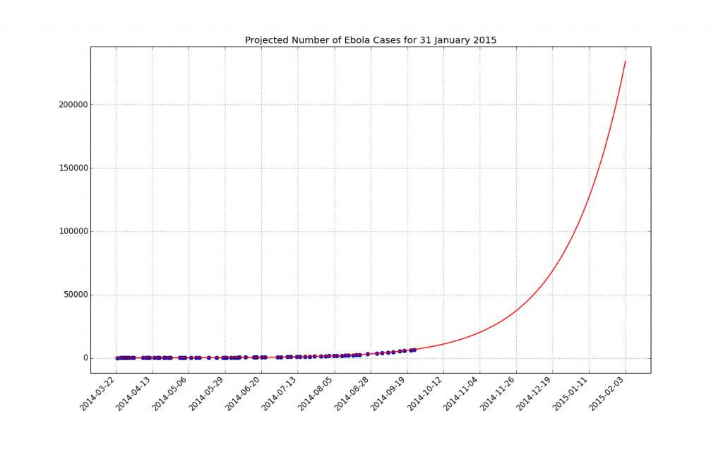
I naïvely plot a projection of the curve fitting function in Figure 3. What this curve predicts is that at the present growth rate – assuming no increases in the means to treat this outbreak – nearly 250,000 people will become infected by the end of January 2015. Now I’m not an epidemiologist. I’m a numbers freak and I’m playing around with the easiest data to get at. Still, this is quite shocking. It means this virus could move into the embedded status alluded to at the beginning of this article.
So how accurate are my projections? I read the article predicting the 1.4 million infections as well as the CDC report [3] on which it is based. My business-as-usual scenario predicts 82% fewer cases than the CDC model. Remember that growth rate factor? My predictions assumed it doesn’t change over the next four months but as we’ve seen it has already changed during the current outbreak such that the doubling rate has gone from 48 to 26 days. The CDC projection also models an increasing growth rate. They accurately model human and physical aid supplies. Lastly, they show how the need arises for a correction factor of 2.5 in the number of all reported cases to date. This means that the number of cases that governments are reporting to WHO are grossly underreported. They arrive at this number by comparing the reported number of cases to the actual count of victims and hospital beds in use by aid facilities; that is, by working with those in the field, in-the-know.
The CDC model is dire. If nothing is done to increase the worldwide response to this outbreak we are going to see this virus become part of our daily lives and not only in West Africa. With such weak borders and increasing global travel it will not belong until this hits the rest of the world’s nations.
References
[1] CDC: Outbreaks Chronology: Ebola Virus Disease
[2] Ebola Virus Outbreak In West Africa
[3] MMWR: Estimating the Future Number of Cases in the Ebola Epidemic – Liberia and Sierra Leone, 2014-2015


Recent Comments